
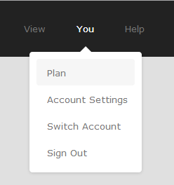
Animated drop down menu by Alex Penny. it have improved the code a lot from the original version for the better and more cross browser compatibility.
Coding:
- In the HTML box, you just need to write the code that belongs to your <body>
- If you want to put something that must go inside <head> then you can simply write full HTML that starts either with a doctype or with <html>.
- You can use tools like Prefixfree, Normalize, and other Preprocessors like Jade, HAML, Stylus, Less, SASS, Coffeescript and much more!
- Just take a look at the Preferences Pane on the left.
- Zen Coding in HTML and CSS is also supported
- Code font-size can be adjusted! Code box alignment can also be changed to horizontal or vertical positions.
- Need more JS resources ? Try cdnjs.com
THE CSS3:
/*---------- Wrapper --------------------*/

nav {
 width: 100%;
 height: 80px;
 background: #222;
}

ul {
 text-align: center;
}

ul li {
 font: 13px Verdana, 'Lucida Grande';
 cursor: pointer;
 -webkit-transition: padding .05s linear;
 -moz-transition: padding .05s linear;
 -ms-transition: padding .05s linear;
 -o-transition: padding .05s linear;
 transition: padding .05s linear;
}
ul li.drop {
 position: relative;
}
ul > li {
 display: inline-block;
}
ul li a {
 line-height: 80px;
 padding: 0 20px;
 height: 80px;
 color: #777;
 -webkit-transition: all .1s ease-out;
 -moz-transition: all .1s ease-out;
 -ms-transition: all .1s ease-out;
 -o-transition: all .1s ease-out;
 transition: all .1s ease-out;
}
ul li a:hover {
 color: #eee;
}

.dropOut .triangle {
 width: 0;
 height: 0;
 position: absolute;
 border-left: 8px solid transparent;
 border-right: 8px solid transparent;
 border-bottom: 8px solid white;
 top: -8px;
 left: 50%;
 margin-left: -8px;
}
.dropdownContain {
 width: 160px;
 position: absolute;
 z-index: 2;
 left: 50%;
 margin-left: -80px; /* half of width */
 top: -400px;
}
.dropOut {
 width: 160px;
 background: white;
 float: left;
 position: relative;
 margin-top: 0px;
 opacity: 0;
 -webkit-border-radius: 4px;
 -moz-border-radius: 4px;
 border-radius: 4px;
 -webkit-box-shadow: 0 1px 6px rgba(0,0,0,.15);
 -moz-box-shadow: 0 1px 6px rgba(0,0,0,.15);
 box-shadow: 0 1px 6px rgba(0,0,0,.15);
 -webkit-transition: all .1s ease-out;
 -moz-transition: all .1s ease-out;
 -ms-transition: all .1s ease-out;
 -o-transition: all .1s ease-out;
 transition: all .1s ease-out;
}

.dropOut ul {
 float: left;
 padding: 10px 0;
}
.dropOut ul li {
 text-align: left;
 float: left;
 width: 125px;
 padding: 12px 0 10px 15px;
 margin: 0px 10px;
 color: #777;
 -webkit-border-radius: 4px;
 -moz-border-radius: 4px;
 border-radius: 4px;
 -webkit-transition: background .1s ease-out;
 -moz-transition: background .1s ease-out;
 -ms-transition: background .1s ease-out;
 -o-transition: background .1s ease-out;
 transition: background .1s ease-out;
}

.dropOut ul li:hover {
 background: #f6f6f6;
}

ul li:hover a { color: white; }
ul li:hover .dropdownContain { top: 65px; }
ul li:hover .underline { border-bottom-color: #777; }
ul li:hover .dropOut { opacity: 1; margin-top: 8px; }
The HTML5  Hi it's Hassan and i'm a Student at College and Having So Much Fun with Blogging and Writing Articles and Spreading Them to World Via Web so Its Cool When you are Blogging.
Any feedback, questions or ideas are always welcome. In case you are posting Code ,then first escape it using Postify and then paste it in the comments
0 comments: